
OMNY Mobile App
MY ROLE
OVERVIEW
OMNY Mobile App is a mobile application that I designed as part of an intensive design course. As the sole UX designer, my responsibilities included conducting research and ideation, and using UX design principles to create final designs.
UX Research | UX Design | Visual Design
PROJECT CONTEXT
(Oct 2021 - Feb 2022)
Mobile App | Solo Project
TOOLS
Figma | Miro
CONTEXT & PROBLEM
As a New Yorker, I have always been frustrated with public transportation. I was excited when the MTA finally launched OMNY. However, I ended up using the Current MetroCard when commuting to Manhattan because OMNY did not offer a mobile app for purchasing unlimited monthly plans as the Current MetroCard does. I noticed that my peers also did not use OMNY for this reason. In fact, according to an article I read, while OMNY usage increased by 4% in July 2021 compared to the previous year, it only accounted for 16% of total fare payments. This means that the majority of payments, 82%, were still made with the Current MetroCard.
THE SOLUTION
Through user interviews, I learned that users are frustrated with the current MetroCard refill system and are waiting for more fare options from OMNY. Based on this information, I hypothesized that users would be interested in using the OMNY Mobile App with a new reloadable system and more fare options.
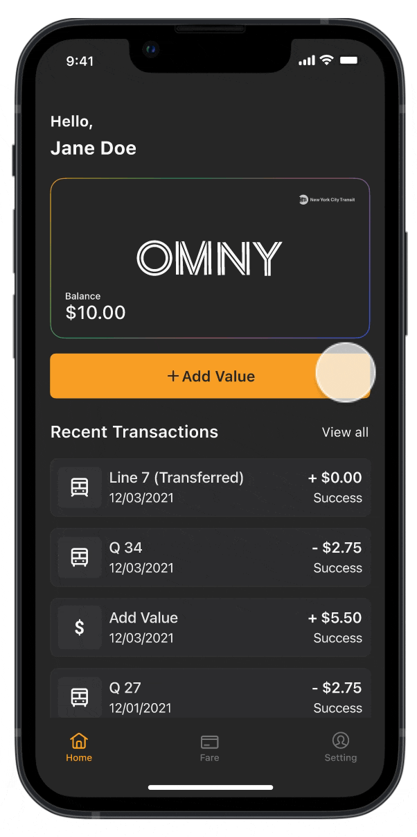
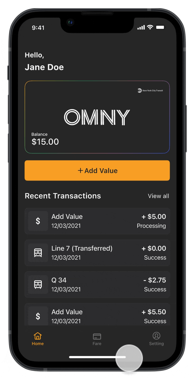
Add Value
Users can easily refill their balance on the go with just a few taps from anywhere and at any time. This feature allows users to refill their balance easily and quickly without the need to visit a location or wait physically. The process can be completed anywhere at any time, making it a convenient option for users.
Fare Plans
With the OMNY App, users can choose the fare that suits their needs, similar to how they would with a MetroCard. Adding a new credit card to the account is also easy if the current one expires. Overall, the app provides the same experience as using a MetroCard without waiting in long lines.
DESIGN PROCESS
Existing Public Transit System
After deciding on a prompt, I wanted to research the current public transportation payment system to understand what factors might drive people to continue using MetroCards. I found that OMNY users pay a higher fare than MetroCard users. It's also worth noting that the MetroCard vending machines being only at stations can inconvenience people who live far from stations and may make it more difficult for them to reload their cards.

User Interview
I conducted user interviews with 5 participants to understand their frustrations and needs when using the current public transportation system and OMNY. I asked specific questions to identify trends and determine what made them uncomfortable using the current MetroCard and OMNY. By analyzing the results of these interviews, I gathered valuable insights into users' experiences and identify areas for improvement.

Competitor Research
I researched three public transportation fare apps, SmartTrip, Clipper, and TAP LA, in the United States to assess the competitive landscape. Based on my analysis, I have identified several practical features that could be introduced to OMNY, such as the ability to pay for rides using multiple payment methods and the option to choose from different fare plans with pass discounts.

Our User
To ensure that my idea meets the needs and goals of my target user, I began by creating a user story and persona. The user story and persona captured a potential user's essence and characteristics, helping me understand one's needs and pain points.

User Flow
After identifying the primary target audience, I created a user flow to understand the steps users take to complete tasks within the app.

Wireframe
During the wireframing phase, I refined my idea using low-fidelity wireframes. The following image is an early version of my design; after conducting user testing and discussing it with my mentor, I updated the details. My designs evolved due to user testing, but I want to show you my starting point.

Testing + Improvements
Once I finished the low-fidelity wireframes, I added some additional details and conducted usability testing with 5 participants. From the testing, I identified areas for improvement and made changes to my design solutions based on the feedback I received.

Changing the action button to be more prominent.
In the original design, the action button needed to be clearly labeled, which made it difficult for users and my mentor to understand its purpose. To solve this problem, I modified the button to be more explicit and easier to locate.

Redefining a feature.
Some users were confused about this function and asked for clarification. They were unsure about its purpose because it was also on the fare tap. One user suggested that it would be helpful to have the same functionality as the MetroCard vending machine for this feature.
Final Design
I completed my final design after conducting multiple tests and making numerous revisions. The design includes all the essential features that allow users to easily and quickly purchase their fares while being visually appealing and user-friendly.

REFLECTION
What I learned,
I previously gained experience with mobile design in a college graphic design class, although the school project's focus was mainly on visual design. It was not until later that I learned about user-centered design. Through this project, I realized that the design process is a continuous loop, starting with research to gather information about user needs and preferences and then moving on to sketches, wireframes, and other stages of development. The experience gave me a broad overview of the design process and helped boost my confidence in my design abilities.
If I had more time, I would...
As part of my efforts to improve the user experience of my mobile fare payment app, I want to explore the various fare discounts offered by the MTA, such as discounts for students, senior citizens, and people with disabilities, and see how these discounts can be incorporated into the app. Due to location constraints, I have yet to be able to fully test out competitors' products and see how they work, but I want to research how competitors allow for multiple Metrocards to be linked to a single account.