
Riff
OVERVIEW
In this project, I worked with a team of three other designers and a group of stakeholders to create three new features for Riff's responsive tablet and mobile browsers. The project lasted for five weeks. My role was to lead the design direction for the tablet browser while collaborating with the mobile team on ideation. The project's main focus was to improve the user experience and redesign the user interface.
MY ROLE
UX Research | UX Design | Visual Design
PROJECT CONTEXT (May - June 2022)
Tablet Browser | Client Project
TEAM
UX Designers (4) | CEO | Product Lead
TOOLS
Figma | FigJam | Slack
CONTEXT & PROBLEM
Riff is an online platform that offers personalized business coaching for musicians based in Canada. It also helps musicians connect with industry experts and create networking opportunities. The platform is currently available as a desktop web app, but the company plans to expand its service to tablet and mobile browsers. However, the existing product has inconsistent design issues that have led to confusion among users. Therefore, the company seeks a cohesive design for its new tablet and mobile browser service.
How might we provide a better experience for users through improved design?
CLIENT EXPECTATION
At our initial meeting, the CEO of the company and the product lead provided their business information and current situation. During the initial meeting, they gave us the company's expectations of this project:

Discovering issues

Responsive Design

Improving Design
THE SOLUTION
To solve the company's problems, our team went through research, ideation, and UX design principles from inception to the final design.
Our solutions met the client's expectations and reduced user friction compared to the previous designs.
Client expectation
To meet the client's expectation of a responsive design for mobile and tablet browsers, we implemented a design process that ensured that the user interface and user experience were optimized for use on these devices. This allowed users to access the service from any location and device without encountering any issues or limitations. Additionally, we worked to improve the brand identity by ensuring consistency across all devices, enhancing the user experience, and helping to create a cohesive and professional image for the company.
Reducing user friction
To further improve the user experience, we focused on reducing user friction by creating a consistent design across all pages. This allows users to quickly recognize and navigate the platform without feeling lost or confused. We also simplified the process of filling out forms by eliminating unnecessary steps or complications. These efforts helped streamline the user experience and make it more enjoyable.
1. DISCOVERING ISSUES
Existing product research
The company provided previous user testing videos, so the mobile team and I analyzed the user friction. Our team discovered problems with the UI elements, user-centered design, and cohesive design for creating tablet and mobile browsers.
-
Users drop off in the middle of the onboarding process.
-
Users feel the product is unfinished.
A) Findings from previous testing videos:
B) Findings from current designs:
1. Poor usability


2. Interface design


User Flows
To better understand the product, we looked deeper at the current product to identify core issues by creating user flows. Due to time constraints, we split up the tasks into features. I was tasked with one of the features, creating a proposal, and I redefined user flows based on the company's resources.
After combining all user flows into one file, our team decided to start with mobile wireframing first because the mobile screens were much smaller than the tablet, so we decided to try an optimized mobile experience and then go to the tablet browser.

2. RESPONSIVE DESIGN
Responsive design research
While the mobile team was working on wireframing, I researched the industry leaders for responsive design. Most of Riff's products include filling out forms and data dashboards, so layout design is critical to increasing usability and readability.

Slack, Google Form, Google Analytics
-
Mainly two columns for the tablet browser
-
Keep the layout designs with any orientation on the tablet
Wireframe
When the mobile team finished the wireframes and handed them out to me, I narrowed down my idea through mid-fidelity. I iterated many times to make our design consistent. We also kept discussing with stakeholders to revise the details.


3. IMPROVING DESIGN
UI improvement in the product
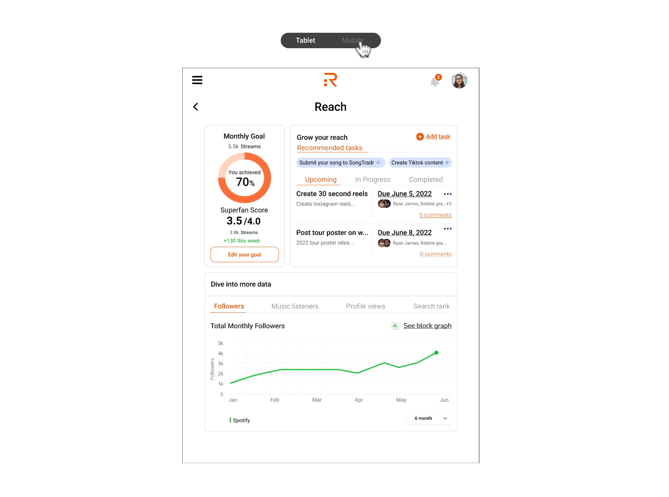
After iterating on wireframes, I determined the company's general visual style for the tablet and mobile browsers. The company has multiple style guides, so these led to inconsistent design. However, I tried to keep the design of the current desktop web app the same as possible because of the company's technical constraints.
1. Changing the background color from gray to white because the white background is timeless, neat, and clean.

2. Redesigning a primary and secondary button. According to our findings, users got confused about the gray-colored action button. It was low-accessibility as well. Therefore, I tested new buttons by WCAG for accessibility when I decided on the color.

3. Changing the left-side navigation to the hamburger menu. The company used two different navigation designs for each feature. Moreover, we noticed that the fixed left-side navigation bar took up space on the mobile screen, and users needed clarification about the icons on the current product.

User Testing & Iteration
To test our solutions, the mobile team and I conducted user testing with a Riff user, and I also had sessions with two non-Riff users. We did not find significant issues with the project timeline and fan-growing dashboard features, but we found some improvements in the creating proposal feature.
Creating proposal form


1. Third-party connection
-
Revised to add 'Skip' for each potential connection.

2. Explanation
-
Users did not know where and how the data came from.
-
Added short explanations for easy understanding.


3. Add Team
-
Users struggled to add additional team members.
-
Clarified the task expectations.
FINAL DESIGN
1. Tablet Browser

2. Tablet - Mobile View

REFLECTION
What I learned,
This project was my first collaboration project, and through the process, I learned the importance of effective communication to accelerate the project efficiently. At the beginning of the project, we encountered some delays due to a lack of communication with the Riff team. However, as we improved our communication with them, we made progress and completed the project on time. This experience taught me the value of clear and consistent communication in any team setting.
If I had more time,
I would like to have another user testing session. Due to time constraints, we conducted user testing for both the mobile and tablet versions of our product with a Riff user in the same session. However, this led to the user become familiar with the mobile version's task flows, which made it challenging to gather sufficient feedback on the tablet version.