
OMNY
Designing a User-Centered Mobile Fare Payment App
When
Oct 2021 - Feb 2022
Role
UI/UX designer, Researcher
What
Mobile App (iOS)
Tools
Figma, Miro, Zoom
Why
Side project
Why I made this project
As a Korean immigrant with a long-standing familiarity with contactless payment systems for public transportation, I was initially taken aback by the traditional MetroCard system when I arrived in NYC. My past experiences using these systems in Korea, dating back to my middle school days and even earlier with my parents, highlighted the convenience and accessibility of such systems.
However, despite the launch of OMNY, a new and modern contactless payment system for public transportation in NYC, I was disappointed to find that it lacked the multiple fare options available on the traditional MetroCard. This inspired me to bridge the gap between these two systems and design a solution that combines the convenience of OMNY with flexible fare options, providing an improved and more convenient public transportation experience for all commuters.
My goal is to bring the accessibility and innovation of public transportation from my home country to my new home in NYC and create a more seamless experience for all commuters.
Market research + User interview
To understand the impact of OMNY, NYC's new contactless payment system for public transportation, on commuters' payment methods and experiences, I conducted market research and user interviews. The market research revealed a 4% increase in OMNY usage in July 2021 compared to the previous year, accounting for only 16% of total fare payments.
Findings
To gain further insight, I conducted user interviews and discovered that affordability is a crucial factor in commuters' decision-making process for choosing their preferred fare payment method. To support these findings, I analyzed the round-trip fares of both traditional MetroCard and OMNY, as round trips reflect the average commuting pattern of regular subway users. The comparison showed that affordability and cost play a significant role in commuters' decision-making.

Continued: user interview
To further elaborate on the findings from the user interviews, it was clear that participants had several pain points with the current public transportation payment system. The objective of this study was to understand the impact of OMNY, NYC's new contactless payment system for public transportation, on commuters' payment methods and experiences. However, through user interviews, I gained a deeper understanding of commuters' frustrations and needs with the current public transportation payment system, as well as their perceptions of OMNY. This study aims to provide valuable insights into current payment methods and OMNY, to improve commuters' overall public transportation experience.
Insights from user interview

Competitive analysis
To assess the competitive landscape, I analyzed three public transportation fare apps - SmartTrip, Clipper, and TAP LA - during my competitor research.

SmarTrip
Clipper
Tap LA
Opportunities and Challenges for OMNY
The competitor research showed potential features for OMNY to improve competitiveness, such as multiple payment options and fare plans with discounts. Negative feedback from users included issues with navigation, accessibility for individuals with disabilities, and incorrect display of balances.
Competitors' problems from customer reviews

Persona
By creating a persona, I was able to focus on the specific needs and challenges of my target user and tailor my solution to meet those needs. This helped me to design a more user-centered solution that addresses the current MetroCard problems and is more appealing to my target audience.

Flow diagram
This flow diagram focuses on the main feature of the OMNY app, which is the ability for users to add value to their accounts and purchase fare plans. By mapping out the interactions between different elements on the page, I ensured a smooth user experience for this key feature. By prioritizing this main feature in my flow diagram, I aimed to address the main pain points and goals expressed by my target user persona.

Wireframes
During the wire framing phase, I developed my idea further with the help of low-fidelity wireframes. The image below showcases an initial version of my design for the main feature of the app. While my designs underwent further changes, this image serves as an illustration of my starting point.

High-fidelity: Font and color
After numerous iterations on my low-fidelity wireframes, I moved on to defining the font and colors for my high-fidelity design.

High-fidelity: Accessibility check
Initially, I had chosen a bright font color for the CTA without much consideration for accessibility. However, after being advised by my mentor to check the contrast, I was surprised to find that it did not meet the standards. Thanks to my mentor's guidance, I was able to improve the accessibility of my design and ensure that it met all WCAG standards.

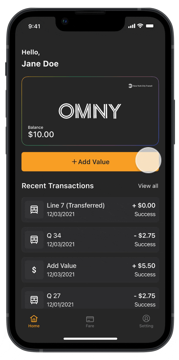
High-fidelity: High-fidelity mockups
I revised the CTA button and details of the design after conducting an accessibility check, and completed the high-fidelity mockup.

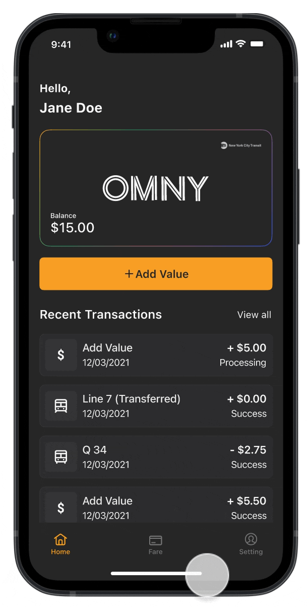
High-fidelity: Prototypes
I transformed my high-fidelity designs into a functional, clickable prototype to conduct usability testing.
Usability testing
I conducted a usability test with 5 participants via video call, resulting in minimal changes to the design based on their feedback. To further validate my solution, I posted my design on a group page and received an overwhelmingly positive response, with over 300 reactions. No major issues were reported with the design solution.
Reflection
Through this project, I gained insight into the significance of user-centered design and the various phases involved in the design process. My previous experience with mobile design was limited to a college graphic design class, which focused primarily on visual design and did not cover user-centered design. Nonetheless, this project provided me with a comprehensive view of the design process, and it improved my confidence in my design skills. Given more time, I would investigate the fare discounts offered by the MTA and assess how they could be integrated into the app. Additionally, I aim to research how competitors link multiple Metrocards to a single account and evaluate the products of my competitors.